
Project Overview

The Product
Hope Bridge is an app focused on helping homeless people by connecting them with the neighbors. The project requires a tool that brings together individuals who want to help and those in need of assistance. Their target users include everyone concerned about the lives of people on the streets, their urgent health issues, and access to food.

The Problem
Millions of people living on the streets struggle with hunger. While many individuals desire to help, safety concerns prevent direct approaches. Unfortunately, homeless individuals, without access to smartphones, face challenges in reaching out for assistance during urgent health issues.

My Role
UI/UX designer leading the app and responsive website design from conception to delivery.

Project Duration
June 2023 to January 2024

The Goal
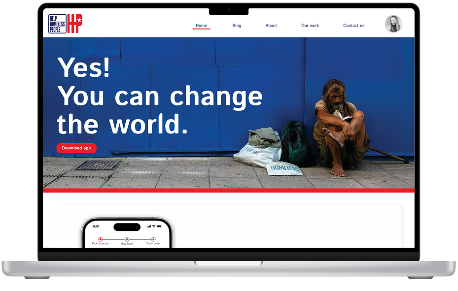
To unite individuals in need with those willing to assist, I've developed both an app and a responsive website.

Responsibilities
Conducting interviews, paper and digital wire framing, low and high-fidelity prototyping, conducting usability studies, accounting for accessibility, iterating on designs, determining information architecture, and responsive design.
Creating entire idea from scratch, finding the brand name, designing logo, creating brand identity.

Understanding the User

User Research: Summary
I use HCA data on homeless people’s problems to develop interview questions, which were then used to conduct user interviews. Most interview participants reported feeling bad about people lives on the street and about there is nothing they can do personally. The feedback received research made it very clear that users would be open willing to help homeless people if they feel safe.
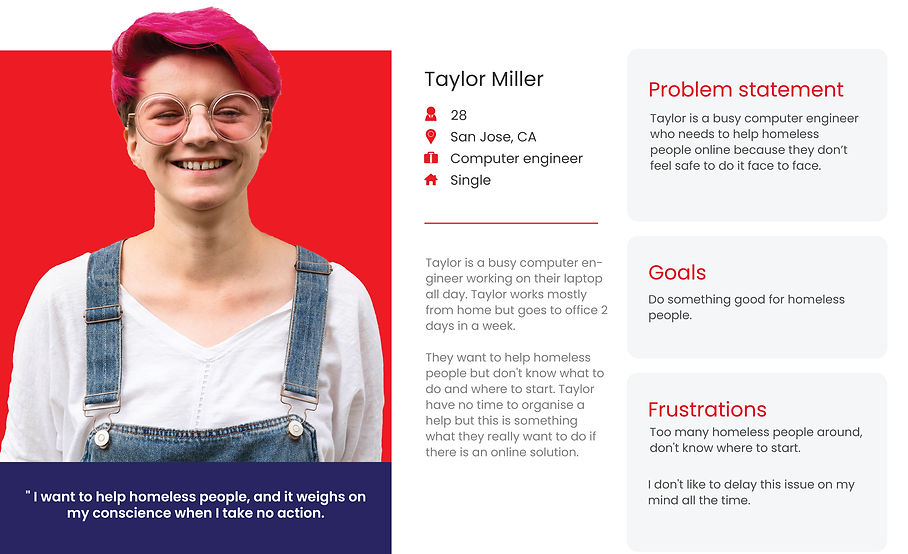
Personas:

Competitive Audit
Actually there is no competitors about this specific subject but I search 3 non-profits in terms of their approach to solving problems. Usually, competitors are generally institutions that only ask for donations and publish cumbersome and outdated articles. Unlike my product, none of them can swiftly assist someone in finding an immediate and direct solution to the problem.

Ideation
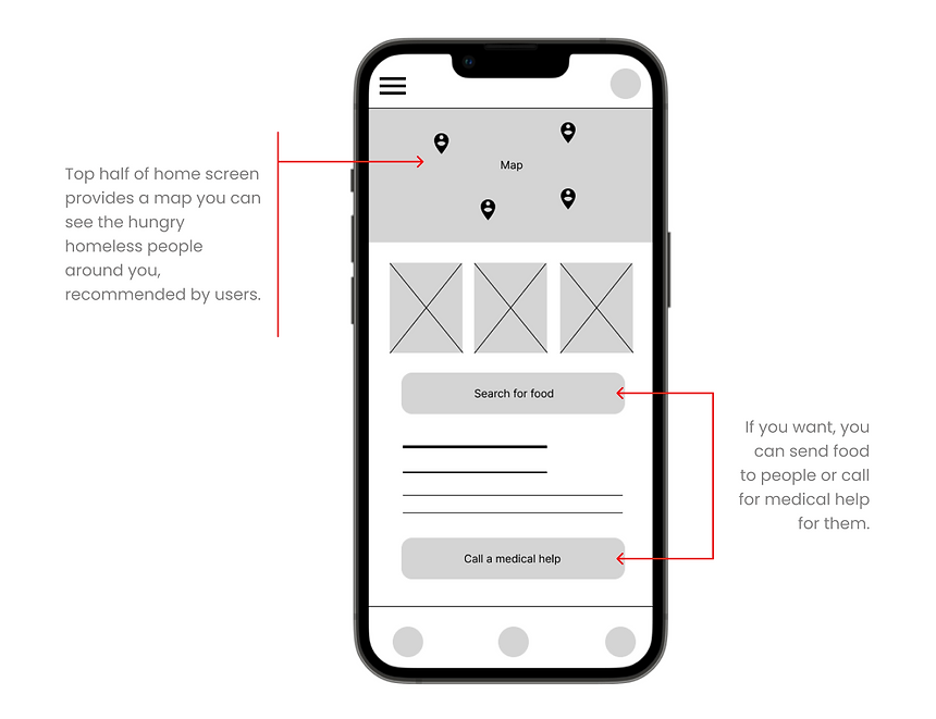
I did a quick ideation exercise to come up with ideas for how to address gaps identified in the competitive audit. My focus was specifically on helping people online. This study produced more than one good idea. However, using all of them simultaneously might lead to confusion. I'm contemplating incorporating these ideas in a way that involves distributing simple, uncomplicated watches to homeless individuals. These watches would allow them to report hunger up to three times a day. Through our app, we can observe these requests for assistance and place orders on their behalf. To streamline the process, the system records homeless individuals' allergies once, enabling them to quickly access food by pressing a button. If I come across a sick homeless person, I can call for help through the app. The app also lets me view nearby homeless individuals on a map, purchase food for them, and track the delivery progress online.

Starting the Design
Digital Wireframes
After ideating and drafting some paper wireframes, I created the initial designs for the HB App. This designs focused on giving immediate help to hungry people who lives on the street.
Low-Fidelity Prototype
To prepare to usability testing, I created a low-fidelity prototype that connected the user flow of helping people.

Usability Study: Parameters
Study Type
Unmoderated Usability Study
Location
CA, USA, Remote
Participants
7 Participants
Length
30-60 Minutes
Usability Study: Findings
These were the main findings uncovered by the usability studies:
Round 1 Findings
Users want to know more about people.
Users want to see more food options.
Users want a track delivery.
Round 2 Findings
They need more accessibility options.
They need to be clear about where they are in the stage of the process.
Refining the Design
Typography& Colors
The project's visual identity is a symphony of Istok Web font in regular, light, medium, italic and bold, accompanied by a soft, gray palette enriched with energetic red and navy accents. White serves as the contrasting canvas, creating a captivating and cohesive visual language throughout. The intention was to use a palette reminiscent of the colors of the US flag to serve as a reminder and encouragement of love for our homeland and humanity.

Icons
Explore a handpicked assortment of circular icons, chosen with precision to complement the app's aesthetic seamlessly. These unique icons not only elevate visual appeal but also play a crucial role in creating a unified and polished design. Each icon adds a touch of visual harmony to enhance the overall aesthetic experience.

Mockups
After the initial usability study, I recognized that users desired to know more about the people they are gonna help. After the usability study, I made a profile card for each person. This boosted engagement.

Key Mockups

High-Fidelity Prototype
The final high-fidelity prototype presented cleaner user flows, making it easier to navigate. It also fulfilled user needs. View the HB App

Accessibility Considerations

Color Contrast Enhancement
Addressed accessibility concerns by enhancing color contrast, ensuring content readability for users with visual impairments and promoting a more inclusive design.

Responsive Design
Developed a responsive design that caters to various devices, ensuring a seamless experience for users with different abilities and across diverse platforms.

Accessible Forms & Input Elements
Designed and implemented accessible forms, including proper labels, error handling, and ARIA attributes, to facilitate easy interaction for users of all abilities.

Voice-Enabled Search
Added voice search to the search bar for an inclusive, hands-free experience, enhancing overall accessibility.
Responsive Design
Sitemap
With the app design completed, I began working on designing the responsive website. First, I created a sitemap to guide the organizational structure of each screen's design, ensuring a cohesive and consistent experience across devices.

Responsive Design
The design accommodates screen size variations, spanning mobile, tablet, and desktop. I optimized the designs to meet the specific user needs of each device and screen size.


Going Forward
Takeaways

Impact
Users have expressed that the app simplifies the process of assisting others. A peer remarked, 'The HB app enables me to help others in a way that's both easy and engaging.'

What I Learned
I discovered that tackling complex challenges required a methodical approach. By meticulously navigating each step of the design process and closely aligning with the unique needs of users, I successfully developed solutions that were not only feasible but also highly valuable.
Next Steps

Conduct Comprehensive
Success Metrics Research
Evaluate the app's effectiveness in achieving its core mission of aiding homeless individuals. Leverage data-driven insights to optimize and enhance overall impact.

Expand Educational Resources
Bolster user engagement by incorporating additional educational materials that shed light on the challenges faced by those experiencing homelessness. Empower users with knowledge, fostering a deeper understanding and empathy.

Implement Rewarding User Incentives
Elevate user participation and motivation by introducing a robust system of incentives and rewards. Recognize and celebrate users who actively contribute to the cause, amplifying the app's positive impact on both individuals and the community at large.